
What the names mean, and how to write them.
Every name in Ofiverse is built the same way. Ofi means office, and the rest of the name says what that part of the office does. This is the charter: where each name comes from, how to write it, the names no longer used, and the rules for the tick, the icons, the logos and the mascot.
Ofi means office.
OFIVIO
- OFIoffice
- Vvirtual
- Iintegrated
- Oops
The office, virtual and integrated: the operations of a company in one place.
VO
- Vvirtual
- Ooffice
Your Virtual Office: VO Chat in text, free, and VO Voice out loud in six native languages.
ARKA
- Aartificial
- Rresponsive
- Kkinetic
- Aagent
Your Artificial Responsive Kinetic Agent: the firm’s own VO room, with the Brass Room inside.
AEC
- Aarchitecture
- Eengineering
- Cconstruction
Ofivio AEC: for architects, engineers and contractors.
Every name, and where it comes from.
| Tile | Name | Built from | What it names |
|---|---|---|---|
 | Ofiverse | Ofi + verse | The office universe: the organisation everything lives in |
 | Ofivio | OFI · V · I · O | Office, virtual, integrated, ops: the platform we sell |
 | Ofivio AEC | Ofivio + AEC | The product for architects, engineers and contractors |
 | Ofivio Business | Ofivio + Business | Project management for every other company, 110% customisable |
 | Ofivio Essentials | Ofivio + Essentials | Books and People, on their own |
 | OfiClassroom | Ofi + classroom | Project management for students, free |
 | VO | V · O | Virtual Office: VO Chat and VO Voice |
 | ARKA | A · R · K · A | Artificial Responsive Kinetic Agent: the firm’s VO room |
 | Oficiate | Ofi + officiate | The automation built into every product |
 | OfiMart | Ofi + mart | The office market inside Ofivio, where modules are bought |
 | OfiDrive | Ofi + drive | The subscription’s storage space |
 | OfiRoom | Ofi + room | The meeting room |
 | OfiCalendar | Ofi + calendar | The office calendar |
 | OfiChat | Ofi + chat | Messaging |
 | OfiShot | Ofi + shot | Capture and media |
 | OfiPOS | Ofi + POS | Point of sale |
 | OfiCase | Ofi + case | The briefcase: your own work and document vault — “Case It” |
 | OfiSho | Ofi + sho(p) | Shopping — “Shop It” |
 | Ofibe | Ofi + be | Identity: website, portfolio, CV — “Be. Build. Belong.” |
 | OfiGrid | Ofi + grid | The professional network — “Are You on Grid?” |
 | OfiVibe | Ofi + vibe | The interactive social platform |
 | OfiNews | Ofi + news | Subscriber publishing, read by the public |
 | OfiPulse | Ofi + pulse | The live broadcast of Ofiverse, fed by Pulse Me |
 | OfiGraph | Ofi + graph | The rating engine: performance, never followers |
 | Ofilo | Ofi + lo | The training and learning institute — “Help Me Ofilo” |
How to write the names.
- Ofivio AEC, never “Ofivio Architecture”.
- OfiRoom, never “Board Room” or “Boardroom”.
- Oficiate, with one f, never “officiate” and never “Automation”.
- OfiMart, never “Marketplace”.
- OfiPOS, never “OfiPO”.
- Ofivio Essentials is Books and People together, never two products.
- Inside a product the parts are departments. What OfiMart sells are modules, and a module brings departments.
- The sibling platforms are Ofibe, OfiGrid, OfiVibe and OfiNews. They come in the package with every plan, Solo included, and are never called premium. Ofilo and OfiSho are the premium memberships, from Professional up.
- In a logo the name is set in capitals (OFIVIO, OFICASE). In running text, use the spellings on this page.
Names we no longer use.
These names belong to the previous Ofivio. Each has a new home, or is gone.
| Old name | Now |
|---|---|
| Ofivio Architecture | Ofivio AEC |
| Ofivio Build (product) | Build, a module bought in OfiMart |
| Engineering | Deleted |
| Ofivio Automate / Automation | Oficiate, built into every product |
| Marketplace | OfiMart |
| Board Room, Boardroom | OfiRoom |
| Books, People (two products) | Ofivio Essentials |
| POS | OfiPOS |
| Ofiblo | Merged into OfiGrid |
| Viordo | Merged into OfiVibe |
| Ofipro | OfiGrid |
| Ofipo | Ofibe |
| Ofivio Briefcase | OfiCase |
The tick, the icons, the logos and the mascot.
The tick
- The red tick is in every icon and in every logo.
- A word with a V takes the tick as its V: OFIVIO, OFIDRIVE.
- A word without a V takes no tick.
Icons
- The coloured box, carrying its sign from the Ofivio family.
- No letters on the box, and never a name under it.
- A white sign on a dark box, an ink sign on a light one. The crimson check is never recoloured, except on the Ofivio mobile app, where the tick runs from dark red to mild red.
- The icon is also the favicon.
Logos
- A logo is the icon beside the word.
- Every F in every logo is the Ofivio F: a top bar standing free above a stem that starts at the middle bar.
- New words are set in Century Gothic capitals, with the grey rule and the pink letter-spaced line.
- White versions sit on dark grounds.
The mascot
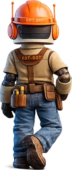
- The VO character, in four poses.
- It stands on the ARKA card, beside the ARKA logo.
The tiles.
One tile each. The tile is the icon and the favicon; no name is written under it.
The words, and the mascot.
A logo is the icon beside the word, in Century Gothic capitals with the Ofivio F.